Monday, October 8, 2018

A question and an answer about recoding several factors simultaneously in R

Data manipulation is a breeze with amazing packages like plyr and dplyr. Recoding factors, which could prove to be a daunting task especially for variables that have many categories, can easily be accomplished with these packages. However, it is important for those learning Data Science to understand how the basic R works.

In this regard, I seek help from R specialists about recoding factors using the base R. My question is about why one notation in recoding factors works while the other doesn’t. I’m sure for R enthusiasts, the answer and solution are straightforward. So, here’s the question.

In the following code, I generate a vector with five categories and 300 observations. I convert the vector to a factor and tabulate it.


Note that by using as.numeric option, I could see the internal level structure for the respective character notation. Let’s say, I would like to recode categories a and f as missing. I can accomplish this with the following code.


Where 1 and 6 correspond to a and f.

Note that I have used the position of the levels rather than the levels themselves to convert the values to missing.

So far so good.

Now let’s assume that I would like to convert categories a and f to grades. The following code, I thought, would work, but it didn’t. It returns varying and erroneous answers.
However, when I refer to levels explicitly, the script works as intended. See the script below.
Hence the question: Why one method works and the other doesn’t? Looking forward to responses from R experts.

The Answer


lebatsnok (https://stackoverflow.com/users/2787952/lebatsnok) answered the question on stackoverflow. The solution is simple. The following code works:


The problem with my approach, as explained by lebastsnok, is the following:

"levels(x) is a character vector with length 6, as.numeric(x) is a logical vector with length 300. So you're trying to index a short vector with a much longer logical vector. In such an indexing, the index vector acts like a "switch", TRUE indicating that you want to see an item in this position in the output, and FALSE indicating that you don't. So which elements of levels(x) are you asking for? (This will be random, you can make it reproducible with set.seed if that matters."



Monday, May 21, 2018

Edward Tufte’s Slopegraphs and political fortunes in Ontario

With fewer than three weeks left in the June 7 provincial elections in Ontario, Canada’s most populous province with 14.2 million persons, the expected outcome is far from certain.

The weekly opinion polls reflect the volatility in public opinion. Progressive Conservatives (PC), one of the main opposition parties, is in the lead with the support of roughly 40 percent of the electorate. The incumbent Ontario Liberals are trailing with their support hanging around lower 20 percent.

The real story in these elections is the unexpected rise in the fortunes of the New Democratic Party (NDP) that has seen a sustained increase in its popularity from less than 20 percent a few weeks ago to mid 30 percent.

As a data scientist/journalist, I have been concerned with how best to represent this information. A scatter plot of sorts would do. However, I would like to demonstrate the change in political fortunes over time with the x-axis representing time. Hence, a time series chart would be more appropriate.

Ideally, I would like to plot what Edward Tufte called a Slopegraph. Tufte, in his 1983 book The Visual Display of Quantitative Information, explained that “Slopegraphs compare changes usually over time for a list of nouns located on an ordinal or interval scale”.

But here’s the problem. No software offers a readymade solution to draw a Slopegraph.

Luckily, I found a way, in fact, two ways, around the challenge with help from colleagues at Stata and R (plotrix).

So, what follows in this blog is the story of the elections in Ontario described with data visualized as Slopegraphs. I tell the story first with Stata and then with the plotrix package in R.

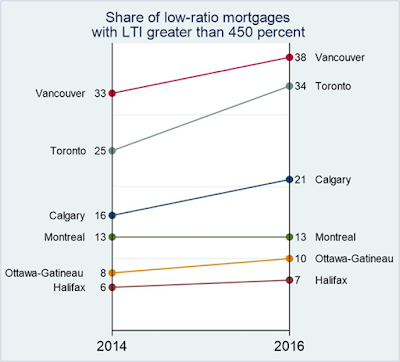
My interest grew in Slopegraphs when I wanted to demonstrate the steep increase in highly leveraged mortgage loans in Canada from 2014 to 2016. I generated the chart in Excel and sent it to Stata requesting help to recreate it.

Stata assigned my request to Derek Wagner whose excellent programming skills resulted in the following chart.


Derek built the chart on the linkplot command built by the uber Stata guru, Professor Nicholas J. Cox. However, a straightforward application of linkplot still required a lot of tweaks that Derek very ably managed. For comparison, see the initial version of the chart generated by linkplot below.


We made the following modifications to the base linkplot:

1.    Narrow the plot by reducing the space between the two time periods.
2.    Label the entities and their respective values at the primary and secondary y-axes.
3.    Add a title and footnotes (if necessary).
4.    Label time periods with custom names.
5.    Colour lines and symbols to match preferences.

Once we apply these tweaks a Slopegraph with the latest poll data for Ontario’s election is drawn as follows.


Notice that in fewer than two weeks, NDP has jumped from 29 percent to 34 percent, almost tying up with the leading PC party whose support has remained steady at 35 percent. The incumbent Ontario Liberals appear to be in free fall from 29 percent to 24 percent.

I must admit that I have sort of cheated in the above chart. Note that both Liberals and NDP secured 29 percent of the support in the poll conducted on May 06. In the original chart drawn with Stata’s code, their labels overlapped resulting in unintelligible text. I fixed this manually by manipulating the image in PowerPoint.

I wanted to replicate the above chart in R. I tried a few packages, but nothing really worked until I landed on the plotrix package that carries the bumpchart command. In fact, Edward Tufte in Beautiful Evidence (2006) mentions that bumpcharts may be considered as slopegraphs.

A straightforward application of bumpchart from the plotrix package labelled the party names but not the respective percentages of support each party commanded.

Dr. Jim Lemon authored bumpchart. I turned to him for help. Jim was kind enough to write a custom function, bumpchart2, that I used to create a Slopegraph like the one I generated with Stata. For comparison, see the chart below.


As with the Slopegraph generated with Stata, I manually manipulated the labels to prevent NDP and Liberal labels from overlapping.

Data Scientist must dig even deeper

The job of a data scientist, unlike a computer scientist or a statistician, is not done by estimating models and drawing figures. A data scientist must tell a story with all caveats that might apply. So, here’s the story about what can go wrong with polls.

The most important lesson about forecasting from Brexit and the last US Presidential elections is that one cannot rely on polls to determine the future electoral outcomes. Most polls in the UK predicted a NO vote for Brexit. In the US, most polls forecasted Hillary Clinton to be the winner. Both forecasts went horribly wrong.

When it comes to polls, one must determine who sponsored the poll, what methods were used, and how representative is the sample of the underlying population. Asking the wrong question to the right people or posing the right question to the wrong people (non-representative sample) can deliver problematic results.

Polling is as much science as it is arts. Late Warren Mitofsky, who pioneered exit polls and innovated political survey research, remains a legend in political polling. His painstakingly cautious approach to polling is why he remains a respected name in market research.

Today, the advances in communication and information technologies have made survey research easier to conduct but more difficult to be precise. No longer can one rely on random digit dialling, a Mitosky innovation, to reach a representative sample. Younger cohorts sparingly subscribe to land telephone lines. The attempts to catch them online poses the risk of fishing for opinions in echo chambers.

Add political polarization to technological challenges, and one realizes the true scope of the difficulties inherent in the task of taking the political pulse of an electorate where motivated pollster may be after not the truth, but a convenient version of it.

Polls also differ by survey instrument, methodology, and sample size. The Abacus Data poll presented above is essentially an online poll of 2,326 respondents. In comparison, a poll by Mainstreet Research used Interactive Voice Response (IVR) system with a sample size of 2,350 respondents. IVR uses automated computerized responses over the telephone to record responses.

Abacus Data and Mainstreet Research use quite different methods with similar sample sizes. Professor Dan Cassino of Fairleigh Dickinson University explained the challenges with polling techniques in a 2016 article in the Harvard Business Review. He favours live telephone interviewers who “are highly experienced and college educated and paying them is the main cost of political surveys.”  

Professor Cassino believes that techniques like IVR make “polling faster and cheaper,” but these systems are hardly foolproof with lower response rates. They cannot legally reach cellphones. “IVR may work for populations of older, whiter voters with landlines, such as in some Republican primary races, but they’re not generally useful,” explained Professor Cassino.

Similarly, online polls are limited in the sense that in the US alone 16 percent Americans don’t use the Internet.

With these caveats in mind, a plot of Mainstreet Research data reveals quite a different picture where the NDP doesn’t seem to pose an immediate and direct challenge to the PC party.

So, here’s the summary. Slopegraph is a useful tool to summarize change over time between distinct entities. Ontario is likely to have a new government on June 7. It is though, far from being certain whether the PC Party or NDP will assume office. Nevertheless, Slopergaphs generate visuals that expose the uncertainty in the forthcoming elections.


Note: To generate the charts in this blog, you can download data and code for Stata and Plotrix (R) by clicking HERE.


Saturday, March 10, 2018

R: simple for complex tasks, complex for simple tasks

When it comes to undertaking complex data science projects, R is the preferred choice for many. Why? Because handling complex tasks is simpler in R than other comparable platforms.

Regrettably, the same is not true for performing simpler tasks, which I would argue is rather complex in base R. Hence, the title -- R: simple for complex tasks, complex for simple tasks.

Consider a simple, yet mandatory, task of generating summary statistics for a research project involving tabular data. In most social science disciplines, summary statistics for continuous variables require generating mean, standard deviation, number of observations, and perhaps minimum and maximum. One would have hoped to see a function in base R to generate such table. But there isn’t one.

Of course, several user-written packages, such as psyche, can generate descriptive statistics in a tabular format. However, this requires one to have advanced knowledge of R and the capabilities hidden in specialized packages whose number now exceed 12,000 (as of March 2018). Keeping abreast of the functionality embedded in user-written packages is time-consuming.

Some would argue that the summary command in base R is an option. I humbly disagree.

First, the output from summary is not in a tabular format that one could just copy and paste into a document. It would require significant processing before a simple table with summary statistics for more than one continuous variable could be generated. Second, summary command does not report standard deviation.

I teach business analytics to undergraduate and MBA students. While business students need to know statistics, they are not studying to become statisticians. Their goal in life is to be informed and proficient consumers of statistical analysis.

So, imagine an undergraduate class with 150 students learning to generate a simple table that reports summary statistics for more than one continuous variable. The simple task requires knowledge of several R commands. By the time one teaches these commands to students, most have made up their mind to do the analysis in Microsoft Excel instead.

Had there been a simple command to generate descriptive statistics in base R, this would not be a challenge for instructors trying to bring thousands more into R’s fold.

In the following paragraphs, I will illustrate the challenge with an example and identify an R package that generates a simple table of descriptive statistics.

I use mtcars dataset, which is available with R. The following commands load the dataset and display the first few observations with all the variables.

data(mtcars)
head(mtcars)

As stated earlier, one can use summary command to produce descriptive statistics.

summary(mtcars)

Let’s say one would like to generate descriptive statistics including mean, standard deviation, and the number of observations for the following continuous variables: mpg, disp, and hp. One can use the sapply command and generate the three statistics separately and combined them later using the cbind command.

The following command will create a vector of means.

mean.cars = with(mtcars, sapply(mtcars[c("mpg", "disp",  "hp")], mean))

Note that the above syntax requires someone learning R to know the following:

1.    Either to attach the dataset or to use with command so that sapply could recognize variables.
2.    Knowledge of subsetting variables in R
3.    Familiarity with c to combine variables
4.    Being aware of enclosing variable names in quotes

We can use similar syntax to determine standard deviation and the number of observations.

sd.cars = with(mtcars, sapply(mtcars[c("mpg", "disp",  "hp")], sd)); sd.cars
n.cars = with(mtcars, sapply(mtcars[c("mpg", "disp",  "hp")], length)); n.cars

Note that the user needs to know that the command for number of observations is length and for standard deviation is sd.

Once we have the three vectors, we can combine them using cbind that generates the following table.

cbind(n.cars, mean.cars, sd.cars)

     n.cars mean.cars    sd.cars
mpg      32  20.09062   6.026948
disp     32 230.72188 123.938694
hp       32 146.68750  68.562868

Again, one needs to know the round command to restrict the output to a specific number of decimals. See below the output with two decimal points.

round(cbind(n.cars, mean.cars, sd.cars),2)

     n.cars mean.cars sd.cars
mpg      32     20.09    6.03
disp     32    230.72  123.94
hp       32    146.69   68.56

One can indeed use a custom function to generate the same with one command. See below.

round(with(mtcars, t(sapply(mtcars[c("mpg", "disp",  "hp")],
                    function(x) c(n=length(x), avg=mean(x),
                    stdev=sd(x))))), 2)

      n    avg  stdev
mpg  32  20.09   6.03
disp 32 230.72 123.94
hp   32 146.69  68.56

But the question I have for my fellow instructors is the following. How likely is an undergraduate student taking an introductory course in statistical analysis to be enthused about R if the simplest of the tasks need multiple lines of codes? A simple function in base R could keep students focussed on interpreting data rather than worrying about missing a comma or a parenthesis.

stargazer* is an R package that simplifies this task. Here is the output from stargazer.

library(stargazer)
stargazer(mtcars[c("mpg", "disp",  "hp")], type="text")

============================================
Statistic N   Mean   St. Dev.  Min     Max  
--------------------------------------------
mpg       32 20.091   6.027   10.400 33.900 
disp      32 230.722 123.939  71.100 472.000
hp        32 146.688  68.563    52     335  
--------------------------------------------

A simple task, I argue, should be accomplished simply. My plea will be to include in base R a simple command that may generate the above table with a command as simple as the one below:

descriptives(mpg, disp, hp)


*  Hlavac, Marek (2015). stargazer: Well-Formatted Regression and Summary Statistics Tables.  R package version 5.2. http://CRAN.R-project.org/package=stargazer


Wednesday, March 7, 2018

Is it time to ditch the Comparison of Means (T) Test?

For over a century, academics have been teaching the Student’s T-test and practitioners have been running it to determine if the mean values of a variable for two groups were statistically different.

It is time to ditch the Comparison of Means (T) Test and rely instead on the ordinary least squares (OLS) Regression.

My motivation for this suggestion is to reduce the learning burden on non-statisticians whose goal is to find a reliable answer to their research question. The current practice is to devote a considerable amount of teaching and learning effort on statistical tests that are redundant in the presence of disaggregate data sets and readily available tools to estimate Regression models.

Before I proceed any further, I must confess that I remain a huge fan of William Sealy Gosset who introduced the T-statistic in 1908. He excelled in intellect and academic generosity. Mr. Gosset published the very paper that introduced the t-statistic under a pseudonym, the Student. To this day, the T-test is known as the Student’s T-test.   

My plea is to replace the Comparison of Means (T-test) with OLS Regression, which of course relies on the T-test. So, I am not necessarily asking for ditching the T-test but instead asking to replace the Comparison of Means Test with OLS Regression.

The following are my reasons:

1.       Pedagogy related reasons:
a.       Teaching Regression instead of other intermediary tests will save instructors considerable time that could be used to illustrate the same concepts with examples using Regression.
b.       Given that there are fewer than 39 hours of lecture time available in a single semester introductory course on applied statistics, much of the course is consumed in covering statistical tests that would be redundant if one were to introduce Regression models sooner in the course.
c.        Academic textbooks for undergraduate students in business, geography, psychology dedicate huge sections to a battery of tests that are redundant in the presence of Regression models.
                                                               i.      Consider the widely used textbook Business Statistics by Ken Black that requires students and instructors to leaf through 500 pages before OLS Regression is introduced.
                                                             ii.      The learning requirements of undergraduate and graduate students not enrolled in economics, mathematics, or statistics programs are quite different. Yet most textbooks and courses attempt to turn all students into professional statisticians.
2.       Applied Analytics reasons
a.       OLS Regression model with a continuous dependent variable and a dichotomous explanatory variable produces the exact same output as the standard Comparison of Means Test.
b.       Extending the comparison to more than two groups is a straightforward extension in Regression where the dependent variable will comprise more than two groups.
                                                               i.      In the tradition statistics teaching approach, one advises students that the T-test is not valid to compare the means for more than two groups and that we must switch to learning a new method, ANOVA.
                                                             ii.      You might have caught on my drift that I am also proposing to replace teaching ANOVA in introductory statistics courses with OLS Regression.
c.        A Comparison of Means Test illustrated as a Regression model is much easier to explain than explaining the output from a conventional T-test.

After introducing Normal and T-distributions, I would, therefore, argue that instructors should jump straight to Regression models.

 Is Regression a valid substitute for T-tests?


In the following lines, I will illustrate that the output generated by OLS Regression models and a Comparison of Means test are identical. I will illustrate examples using Stata and R.

Dataset

I will use Professor Daniel Hamermesh’s data on teaching ratings to illustrate the concepts. In a popular paper, Professor Hamermesh and Amy Parker explore whether good looking professors receive higher teaching evaluations. The dataset comprises teaching evaluation score, beauty score, and instructor/course related metrics for 463 courses and is available for download in R, Stata, and Excel formats at: 


Hypothetically Speaking

Let us test the hypothesis that the average beauty score for male and female instructors is statistically different. The average (normalized) beauty score for male instructors was -0.084 for male instructors and 0.116 for female instructors. The following Box Plot illustrates the difference in beauty scores. The question we would like to answer is whether this apparent difference is statistically significant.


I first illustrate the Comparison of Means Test and OLS Regression assuming Equal Variances in Stata.

 Assuming Equal Variances (Stata)


Download data
       use "https://sites.google.com/site/statsr4us/intro/software/rcmdr-1/teachingratings.dta"
encode gender, gen(sex) // To convert a character variable into a numeric variable.

The T-test is conducted using:

       ttest beauty, by(sex)

The above generates the following output:


As per the above estimates, the average beauty score of female instructors is 0.2 points higher and the t-test value is 2.7209. We can generate the same output by running an OLS regression model using the following command:

reg beauty i.sex

The regression model output is presented below.


Note that the average beauty score for male instructors is -0.2 points lower than that of females and the associated standard errors and t-values (highlighted in yellow) are identical to the ones reported in the Comparison of Means test. 

Unequal Variances


But what about unequal variances? Let us first conduct the t-test using the following syntax:

ttest beauty, by(sex) unequal

The output is presented below:


Note the slight change in standard error and the associated t-test.

To replicate the same results with a Regression model, we need to run a different Stata command that estimates a variance weighted least squares regression. Using Stata’s vwls command:

vwls beauty i.sex


Note that the last two outputs are identical. 

Repeating the same analysis in R


To download data in R, use the following syntax:

url = "https://sites.google.com/site/statsr4us/intro/software/rcmdr-1/TeachingRatings.rda"
download.file(url,"TeachingRatings.rda")
load("TeachingRatings.rda")

For equal variances, the following syntax is used for T-test and the OLS regression model.
t.test(beauty ~ gender, var.equal=T)
summary(lm(beauty ~ gender))

The above generates the following identical output as Stata.


For unequal variances, we need to install and load the nlme package to run a gls version of the variance weighted least square Regression model.

t.test(beauty ~ gender)
install.packages(“nlme”)
library(nlme)
summary(gls(beauty ~ gender,  weights=varIdent(form = ~ 1 | gender)))

The above generates the following output:


So there we have it, OLS Regression is an excellent substitute for the Comparison of Means test.


Sunday, January 28, 2018

When it comes to Amazon's HQ2, you should be careful what you wish for

By Murtaza Haider and Stephen Moranis
Note: This article originally appeared in the Financial Post on January 25, 2018

Amazon.com Inc. has turned the search for a home for its second headquarters (HQ2) into an episode of The Bachelorette, with cities across North America trying to woo the online retailer.
The Seattle-based tech giant has narrowed down the choice to 20 cities, with Toronto being the only Canadian location in the running.
While many in Toronto, including its mayor, are hoping to be the ideal suitor for Amazon HQ2, one must be mindful of the challenges such a union may pose.
Amazon announced in September last year that its second headquarters will employ 50,000 high-earners with an average salary of US$100,000. It will also require 8 million square feet (SFT) of office and commercial space.
A capacity-constrained city with a perennial shortage of affordable housing and limited transport capacity, Toronto may be courting trouble by pursuing thousands of additional highly-paid workers. If you think housing prices and rents are unaffordable now, wait until the Amazon code warriors land to fight you for housing or a seat on the subway.
The tech giants do command a much more favourable view in North America than they do in Europe. Still, their reception varies, especially in the cities where these firms are domiciled. Consider San Francisco, which is home to not one but many tech giants and ever mushrooming startups. The city attracts high-earning tech talent from across the globe to staff innovative labs and R&D departments.
These highly paid workers routinely outbid locals and other workers in housing and other markets. No longer can one ask for a conditional sale offer that is subject to financing because a 20-something whiz kid will readily pay cash to push other bidders aside.
We wonder whether Toronto’s residents, or those of whichever city ultimately wins Amazon’s heart, will face the same competition from Amazon employees as do the residents of Seattle? The answer lies in the relative affordability gap.
Amazon employees with an average income of US$100,000 will compete against Toronto residents whose individual median income in 2015 was just $30,089. It is quite likely that the bidding wars that high-earning tech workers have won hands down in other cities will end in their favour in the city chosen for Amazon HQ2.
While we are mindful of the challenges that Amazon HQ2 may pose for a capacity-constrained Toronto, we are also alive to the opportunities it will present. For starters, Toronto can use 50,000 high-paying jobs.

GIG ECONOMY

The emergence of the gig economy has had an adverse impact in the City of Toronto, where the employment growth has largely concentrated in the part-time category. Between 2006 and 2016, full-time jobs grew by a mere 8.7 per cent in Toronto, while the number of part-time jobs grew at four times that rate.
While being the largest employment hub in Canada, with an inventory of roughly 180 million square feet, an influx of 8 million square feet of first-rate office space will improve the overall quality of commercial real estate in Toronto. It could also be a boon for office construction and a significant source of new property tax revenue for the city.
But those hoping the city itself might make money should seriously consider the fate of cities lucky enough to host the Olympics, which more often than not end up costing cities billions more than they budgeted for.
Toronto may still pursue Amazon HQ2, but it should do so with the full knowledge of its strengths and vulnerabilities. At the very least, it should create contingency plans to address the resulting infrastructure deficit (not just public transit) and housing affordability issues before it throws open its doors for Amazon.
Murtaza Haider is an associate professor at Ryerson University. Stephen Moranis is a real estate industry veteran. They can be reached at info@hmbulletin.com.