
The Canadian newspaper, Globe and Mail, is a leader in diction and style, but it may need improvement in the ‘grammar of graphics’.
Globe’s recent depiction of metropolitan economic growth in the series Off the Charts was way off the mark. The chart plotted the current and forecasted GDP growth rates for select cities in Canada. The red-coloured upward sloping lines depicted cities with increasing economic growth rates and the grey-colored downward sloping lines highlighted those with slowing economic growth.
There is, however, a small problem. The chart erroneously showed some slowing economies as growing and vice versa. Furthermore, the trajectory of the sloping lines would mislead the readers to assume that cities with parallel lines enjoyed a similar increase in the growth rate, which, of course, is not true. The graphical faux pas was certainly avoidable had a bar chart were used.
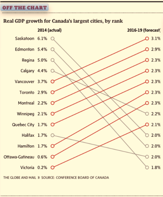
Source: The Globe and Mail, Page B6, May 15.
Of course, the Globe and Mail is not alone in coming up with math that simply doesn’t add up. While covering the Scottish independence vote in September 2014, CNN reported that Scots voted a 110% in the referendum such that 58% voted yes and another 52% voted no.
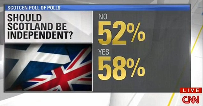
Source: Mail Online. September 19, 2014
The recent rise of data journalism has witnessed the emergence of data visualization where the editors increasingly reinforce narrative with creative info-graphics. While major news outlets such as The Economist, The New York Times, and the Wall Street Journal retained experts in data science and visualization, most newspapers have entrusted the task to the graphics departments that rely on tools that are not specifically designed for data visualization. At times, the outcome is math- and logic-defying graphics that present a false picture.
Even when charts correctly depict data, at times the visualizations are too complex for the ordinary newsreader to grasp. Powerful data visualizations tools, such as D3 (a JavaScript library) are often abused to create graphics too rich in detail to comprehend. The use of Hierarchical Edge Bundling, for instance, is becoming increasingly popular in the news media resulting in complex graphics that are visually impressive, but conceptually confusing.
Edward Tufte and Leland Wilkinson have spent a lifetime advising data enthusiasts on how to present data-driven information. Wilkinson is the author of The Grammar of Graphics, which sets out the fundamentals for presenting data. Wilkinson’s writings inspired Hadley Wickham to develop ggplot2, a graphing engine for R, which is increasingly becoming the tool of choice for data scientists.
Tufte inspired Dona M. Wong, who was the graphics director at the Wall Street Journal. Ms. Wong authored The Wall Street Journal Guide to Information Graphics. Her book is a quintessential guide for those who work with data and would like to present information as charts. She uses examples from the Journal to illustrate the dos and don’ts of presenting data as info-graphics.
Let us return to the forecasted metropolitan growth rates in Canada. I prefer the horizontal bar chart instead. The bar chart offers me several options to highlight the main argument in the story. If I were interested in highlighting cities with the highest gains in growth since 2014, I would sort the cities accordingly, as is illustrated in the graphic on the left (see below). If I were interested in highlighting cities with the highest forecasted growth rate, I would sort them accordingly to result in the graphic on the right.
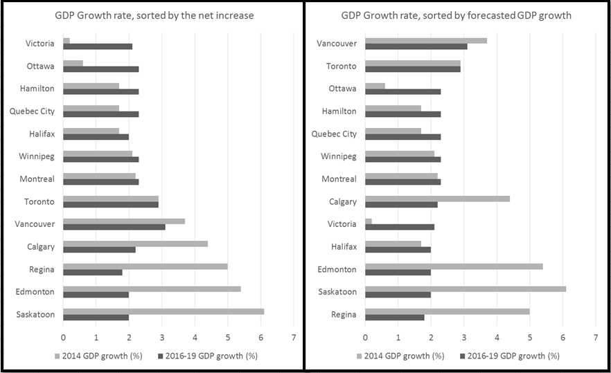
Dana Wong insists on simplicity in rendering. She concludes her book with a simple message for data visualization: simplify, simplify, simplify. The two bar charts simplify the same information presented by the Globe. The results are obvious: I avoid misrepresenting data. One can readily see Halifax’s economy is forecasted to grow and Vancouver’s to shrink. The Globe’s rendering depicted exactly the opposite.