Showing posts with label data. Show all posts

Wednesday, May 20, 2015

Are Canadian newspapers painting false pictures with data?

The Canadian newspaper, Globe and Mail, is a leader in diction and style, but it may need improvement in the ‘grammar of graphics’.

Globe’s recent depiction of metropolitan economic growth in the series Off the Charts was way off the mark. The chart plotted the current and forecasted GDP growth rates for select cities in Canada. The red-coloured upward sloping lines depicted cities with increasing economic growth rates and the grey-colored downward sloping lines highlighted those with slowing economic growth.

There is, however, a small problem. The chart erroneously showed some slowing economies as growing and vice versa. Furthermore, the trajectory of the sloping lines would mislead the readers to assume that cities with parallel lines enjoyed a similar increase in the growth rate, which, of course, is not true. The graphical faux pas was certainly avoidable had a bar chart were used.
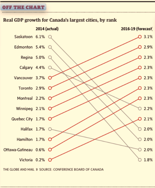
Source: The Globe and Mail, Page B6, May 15.

Of course, the Globe and Mail is not alone in coming up with math that simply doesn’t add up. While covering the Scottish independence vote in September 2014, CNN reported that Scots voted a 110% in the referendum such that 58% voted yes and another 52% voted no.
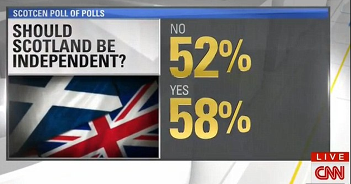
Source: Mail Online. September 19, 2014

The recent rise of data journalism has witnessed the emergence of data visualization where the editors increasingly reinforce narrative with creative info-graphics. While major news outlets such as The Economist, The New York Times, and the Wall Street Journal retained experts in data science and visualization, most newspapers have entrusted the task to the graphics departments that rely on tools that are not specifically designed for data visualization. At times, the outcome is math- and logic-defying graphics that present a false picture.

Even when charts correctly depict data, at times the visualizations are too complex for the ordinary newsreader to grasp. Powerful data visualizations tools, such as D3 (a JavaScript library) are often abused to create graphics too rich in detail to comprehend. The use of Hierarchical Edge Bundling, for instance, is becoming increasingly popular in the news media resulting in complex graphics that are visually impressive, but conceptually confusing.

Edward Tufte and Leland Wilkinson have spent a lifetime advising data enthusiasts on how to present data-driven information. Wilkinson is the author of The Grammar of Graphics, which sets out the fundamentals for presenting data. Wilkinson’s writings inspired Hadley Wickham to develop ggplot2, a graphing engine for R, which is increasingly becoming the tool of choice for data scientists. 

Tufte inspired Dona M. Wong, who was the graphics director at the Wall Street Journal. Ms. Wong authored The Wall Street Journal Guide to Information Graphics. Her book is a quintessential guide for those who work with data and would like to present information as charts. She uses examples from the Journal to illustrate the dos and don’ts of presenting data as info-graphics.

Let us return to the forecasted metropolitan growth rates in Canada. I prefer the horizontal bar chart instead. The bar chart offers me several options to highlight the main argument in the story. If I were interested in highlighting cities with the highest gains in growth since 2014, I would sort the cities accordingly, as is illustrated in the graphic on the left (see below). If I were interested in highlighting cities with the highest forecasted growth rate, I would sort them accordingly to result in the graphic on the right.
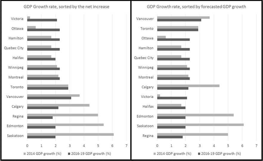
Dana Wong insists on simplicity in rendering. She concludes her book with a simple message for data visualization: simplify, simplify, simplify. The two bar charts simplify the same information presented by the Globe. The results are obvious: I avoid misrepresenting data. One can readily see Halifax’s economy is forecasted to grow and Vancouver’s to shrink. The Globe’s rendering depicted exactly the opposite.


Thursday, January 6, 2011

US Census 2010

The US population counts have ben released. The red states have gained more population than the blue states. Michigan reported a slight loss.

Also, the increase in population in the states that grew the most was a result of increase in immigration and higher birth rates amongst the non-white Hispanics.

For details, visit: http://2010.census.gov/2010census/data/index.php


From Audrey Singer, Senior Fellow, Metropolitan Policy Program

December 21, 2010 —

Nevada, Arizona, Utah and Idaho had the fastest growth this decade while slow growth was seen in Rhode Island, Louisiana, Ohio and New York. Michigan was the only state to see a decline.
Most people poring over the 2010 state counts are doing so with an eye to future elections, but it makes sense to proceed cautiously before drawing any hard conclusions about what that data mean in the political context.
Attention is focused on 12 seats in the House of Representatives that will be leaving slow-growth states in the Northeast and Midwest and moving to the South and Southwest as populations there continued to grow quickly.
Census 2010: America grew at slowest rate since the Depression
Texas is the big winner, with four new House seats. Since the states losing seats are usually regarded as blue, tending to elect Democrats, and those gaining seats are normally considered red, tending to elect Republicans, it would be easy to assume Tuesday's census release is good news for that party and alarming news for Democrats.
It's not that simple.
If we regard simple population change as an indicator of political power, the buildup in red states is indeed significant. However, early next year, the Census Bureau will release counts of the population by race and ethnicity. That number will show shifts of the population that official estimates have pointed to all along: The diversifying of the population is more extensive in areas of fast population growth.
Many of the states that have gained in their head count have gained non-white minorities, especially Hispanics. Estimates already show that four states that gained seats -- Texas, Florida, Arizona and Georgia -- are highly ranked in the Top 10 states for growth in the Hispanic population during this decade.
Moreover, more than half the population growth in those states alone came from increases in the Latino population. These additions were a result of net immigration and births in those states. While the large increase in Hispanics in these high-growth states includes some immigrant newcomers ineligible to vote, eligible Latinos tend to vote Democratic in most of the states that gained seats. That may change by 2012, but much will happen between now and then.
Putting this into further perspective, the U.S. population grew by 9.7% between 2000 and 2010, slower than any decade since the Great Depression in the 1930s. With the Great Recession taking hold at the end of the 2000s, slowing immigration and birth rates, it is possible that slower growth will continue, at least for the short term. Thus, the sizeable increase in minority populations comes at a time when the overall population is growing more slowly.
Thus the sweeping demographic changes going on in our nation are much more significant than just shifts in where people live. We are becoming more diverse, and, as many analysts have noted, we will be a white-minority nation in about 30 years. So simply looking at geography may not yield correct results when we're talking about how new populations may behave and particularly how they may vote.
The excitement that demographers feel about this once-a-decade population snapshot is likely overwhelmed by the enthusiasm of political analysts, who are busy discovering what state-level population shifts mean for state reapportionment and redistricting within states.
But as we can see by looking more carefully at the data, there is more to population shifts than a simple rearranging of the map based on total counts.
We're in for a much more interesting and challenging time than many people may believe.

In praise of the article

As a non-native speaker of English language, I have always struggled with the elusive article, especially ‘the’. When  should ‘the’ be used is not intuitive to me. Therefore, I rely on rules to determine when to use an article. 

Over the years one should not expect any change in the frequency of use of articles in English language. However, one could observe a significant decline in the use of the definite article (the) in American and British English. See the graph below, which shows that in American English the definite article ‘the’ represented 5.5% of the words used in the books published in English in the United States. These are the books scanned by Google as part of its initiative to digitize every published book. However, one sees a decline in the use of the article ‘the’ starting in 1970s. I wonder why. Is the language referring more to proper nouns and hence the decline in ‘the’. Also ‘the’ has been used much more frequently than ‘a’ or ‘an’.

image

The books published in English in England and scanned by Google present almost a similar trend, which is visible in the graph below.

image

Data through the history

Analytics and data are becoming ubiquitous in finance, politics, and other spheres of life, such as friendships where people now boast about how many friends they have on Facebook. It was however not very long ago that the word data was not even part of the everyday lexicon. See the graph below, which shows the evolution of the word data over the past 100 years in the books digitized by Google. The graph immediately below is that of word data used in books published in English in the United States. The y-axis presents the share of the word data in a given year as a percentage of all words published in books in that particular year.

Data saw an earlier increase in its mention in 1920s in American English. However, it was only in the 1960s when the use of data become more pronounced and remained so until mid 1980s. It was the period when Robert McNamara, the most prominent of all quants, tried to win a war in Vietnam by improving the analytics. He failed.  A decline in its mention is observed 1990s and then a quick reversal with a rapid increase in its mention from late 1990s to the first few years of the new millennium. The decline continues again in the mention of the word data.image

The graph below shows the same for books in English that were published in England. The decline in its mention in the past decade seems to be levelling off in the UK.

image

Saturday, December 25, 2010

Using statistics to understand armed conflict

Drew Conway, a doctoral student in New York, uses statistical analysis to make sense of armed conflicts. Pasted below is his graphic that he developed from analyzing Wikileaks data about Afghanistan in July 2010. He used R software to generate the graphic.

The gold standard in newsroom graphics: The New York Times

image

Watch Amanda Cox explain how The New York Times uses the graphics in the print and online edition. The New York Times  has been at the cutting edge of using data and graphics. The hour-long video is worth watching for any one interested in using data to communicate.

http://newmediadays.dk/amanda-cox